Typography for UGC NET Visual Arts: History, Anatomy, Classification and Examples
Visual Arts • Applied Art • Illustrated Study Guide
Typography decoded: learn the letters, recognise the styles, understand the spacing.
Typography is the design and arrangement of type to make written language legible, readable and visually meaningful. It includes the choice of typeface, size, weight, spacing, line length, alignment and hierarchy. A letter is therefore both a language sign and a designed visual form.
These illustrated typography notes for UGC NET Visual Arts connect terminology with what you can actually see. Use the diagrams to recognise features, the tables to build concise notes, and the practice section to test understanding. The focus is Applied Art, with connections to printing history, visual communication and contemporary digital design.
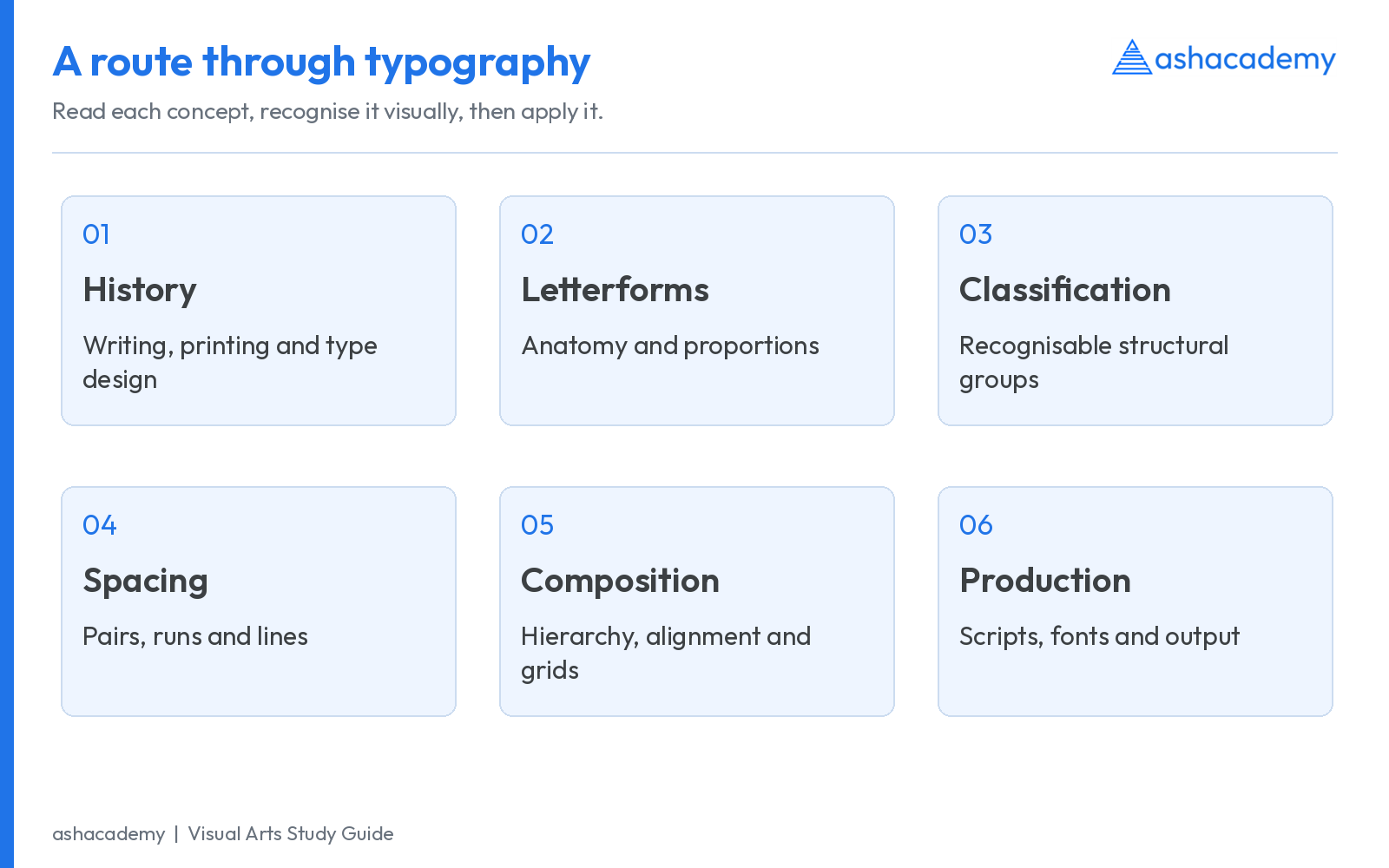
1. Typography, calligraphy, lettering and type design
| Term | What it means | How to recognise it |
|---|---|---|
| Typography | Selecting and arranging reproducible type in a composition. | A magazine spread, book page, website or advertisement set with fonts. |
| Calligraphy | Writing shaped by the movement of a tool, such as a broad nib, brush or pen. | Stroke sequence, tool angle and writing rhythm influence the form. |
| Lettering | Drawing or constructing letters for a particular composition. | A hand-drawn title or custom wordmark made as an individual design. |
| Type design | Designing a coordinated set of glyphs, spacing and behaviour for repeatable use. | A font with letters, punctuation, figures, language coverage and technical data. |
The boundaries can overlap. A calligrapher may draw lettering, and lettering may become the starting point for a typeface. The useful distinction is the process: writing a form, drawing a particular composition, designing a reusable system, or arranging that system on a page.
In an advertisement, the headline attracts attention, body copy explains, captions identify images and the call to action directs the next step. Typography coordinates these roles. A visually dramatic headline is ineffective if the learner cannot distinguish the date, price or instruction beneath it.
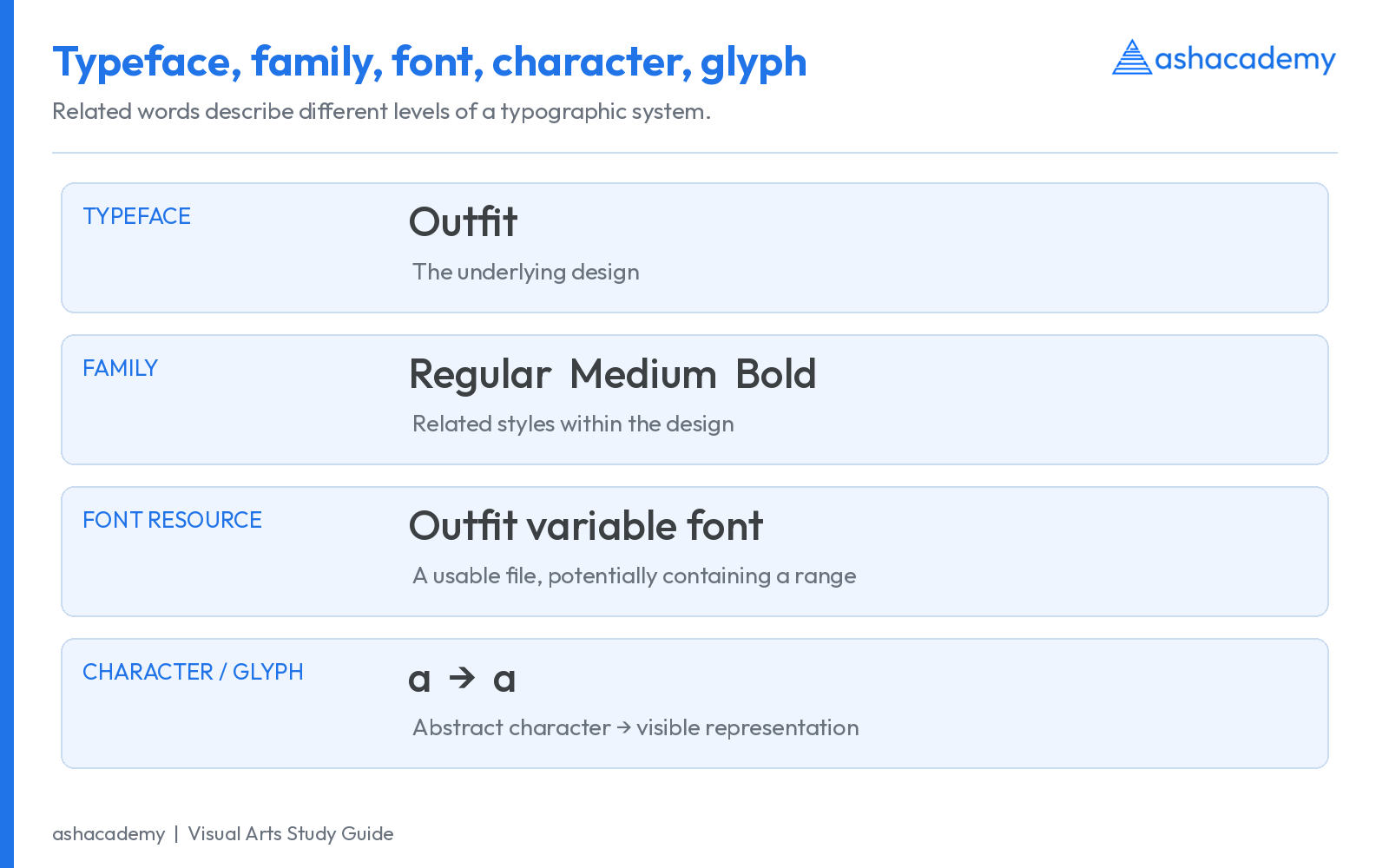
2. Typeface vs font vs family: the essential distinction
| Term | Working definition | Example |
|---|---|---|
| Typeface | The underlying visual design of a coordinated set of letterforms. | Outfit or EB Garamond. |
| Family | Related styles within a type design, often including weights, widths or italics. | A family containing Regular, Medium, Bold and other available styles. |
| Font | An implementable instance or resource that supplies glyphs and typographic behaviour. | Outfit Regular as a static font; an Outfit variable-font file can contain a weight range. |
| Character | An abstract unit in a writing or encoding system. | The Latin letter a. |
| Glyph | A particular visual representation of a character or character sequence. | A default a, an alternate a, or one fi ligature glyph. |
| Style | A named variation within a family. | Regular, Italic, Bold or Condensed, when supplied by that family. |
3. History of typography: a chronological framework
Separate three histories: the development of writing, the development of printing, and the development of type design. Ancient inscriptions and manuscripts are important sources for letterforms, but an inscription is not automatically movable-type printing. Similarly, the history of printing begins before Gutenberg.
| Period / date | Development | Why it matters for typography |
|---|---|---|
| Before movable type | Manuscript traditions and woodblock printing. | Handwritten forms and page conventions shaped later types; woodblocks reproduce a whole carved surface. |
| 1041–1048, China | Bi Sheng developed movable clay type during the Song dynasty. | The account is preserved through Shen Kuo; movable type must be distinguished from woodblock printing. |
| 1377, Korea | Jikji was printed using movable cast-metal type. | The surviving volume is an important earlier metal-type milestone, preceding Gutenberg’s European Bible. |
| c. 1455 | Gutenberg Bible, Mainz. | A major early European book printed with movable metal type, using a Gothic/blackletter design. |
| Late 15th century | Humanist roman type developed in Italian printing; Nicolas Jenson is a central figure. | Manuscript minuscule and classical capital traditions informed roman book type. |
| 1500–1501 | Griffo’s italic appeared briefly in 1500; Aldus’s 1501 editions established sustained book use. | Connect punchcutter Francesco Griffo with printer-publisher Aldus Manutius. |
| 18th century | Caslon, Baskerville, the Didot family and Bodoni. | Book types moved through overlapping old-style, transitional and high-contrast modern tendencies. |
| 19th century | Slab serifs, expanded display types and increasingly prominent sans serifs. | Advertising and industrial printing demanded conspicuous type for posters and commercial communication. |
| 1886 | Mergenthaler’s Linotype entered practical use. | Keyboard composition cast whole lines of metal type, accelerating publishing. |
| 1920s–1930s | Bauhaus, Constructivist influences and New Typography. | Asymmetry, sans serifs, photomontage and functional organisation challenged symmetrical conventions. |
| 1927 / 1928 | Futura released in 1927; Die Neue Typographie published in 1928. | Paul Renner’s typeface and Jan Tschichold’s book are different milestones. |
| 1932 | Times New Roman appeared in The Times. | The newspaper’s first issue using it was 3 October 1932; commercial release followed in 1933. |
| 1957 | Helvetica and Univers. | Two influential sans-serif developments, associated with different designers and foundries. |
| Mid–late 20th century | Phototypesetting and then digital composition. | Type could be composed without assembling physical printing sorts. |
| Contemporary practice | OpenType shaping, web fonts, multilingual families and variable fonts. | Type now behaves as a responsive system across scripts, devices, sizes and design axes. |
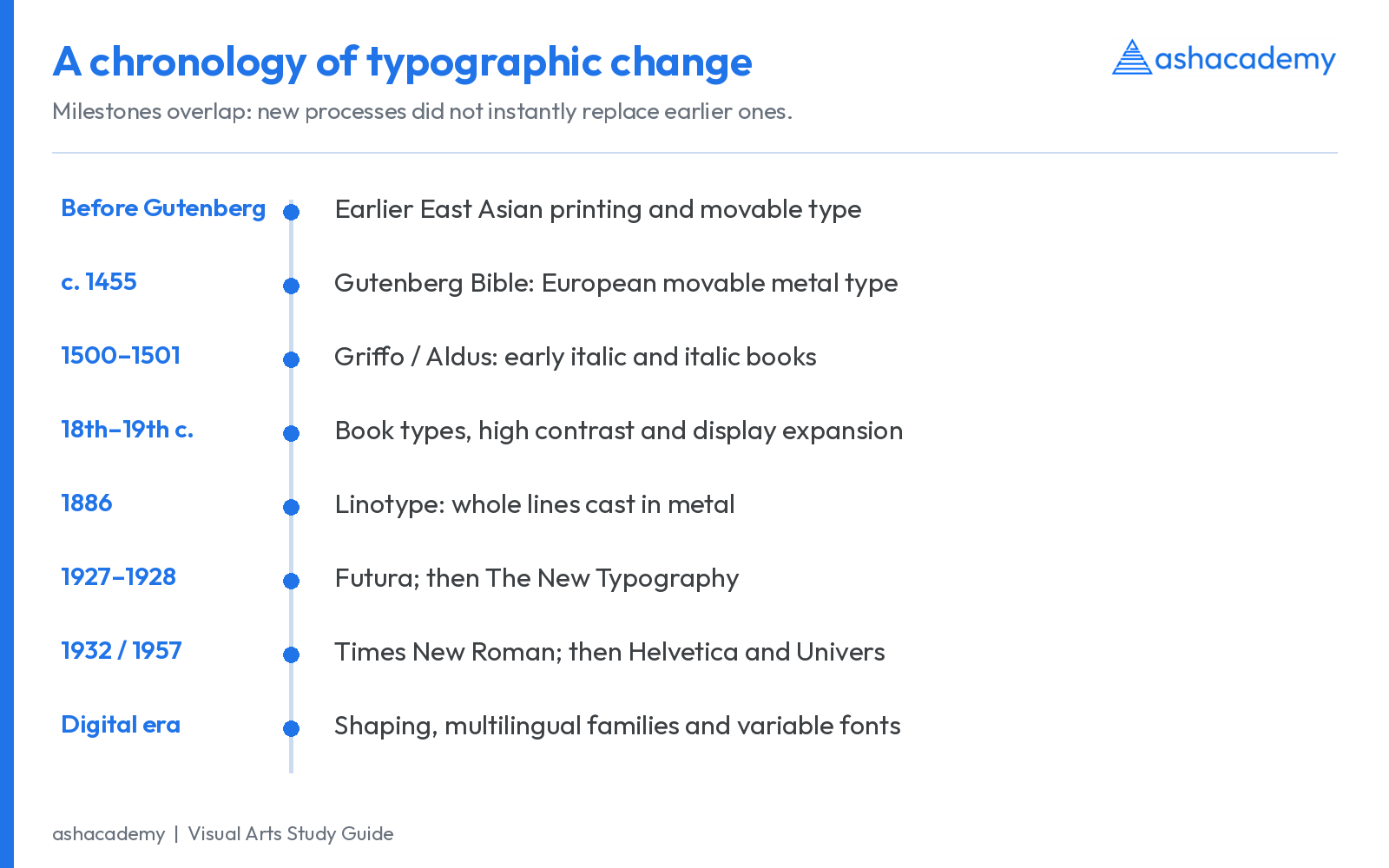
Historical checks: Asian Art Museum: Bi Sheng and movable type; BnF: Jikji, 1377; Library of Congress: Gutenberg Bible; Library of Congress: printing before Gutenberg; Cambridge University Library: Aldine italic, 1501; Biblioteca Marciana: italic in 1500 and 1501; Science Museum Group: Ottmar Mergenthaler; Science Museum Group: Times New Roman.
Why roman, italic and blackletter are different terms
Roman usually describes upright type in contrast to italic; it can also refer to the historical roman letter tradition. Italic is often a separately drawn cursive companion, not simply an upright font slanted electronically. Blackletter describes a group of dense, broken or angular forms connected with European Gothic manuscript traditions. “Gothic” is context-sensitive: some American sans-serif type names also use Gothic, so inspect the actual letterforms.
4. Indian typography: manuscripts, printing and multilingual design
Indian typography cannot be treated as a late copy of Latin typography. It developed through diverse manuscript traditions, scripts, engraving and type-cutting practices, colonial and indigenous publishing, vernacular readerships and contemporary digital design. Type has to accommodate the structure of each writing system.
| Anchor | Development | What to remember |
|---|---|---|
| 1556, Goa | A Jesuit printing press operated at the College of St Paul in Old Goa. | A milestone for the printing press in India, not the beginning of Indian writing or manuscripts. |
| Late 18th century, Bengal | Wilkins and Indian craftsmen, especially Panchanan Karmakar, are central to early Bengali type development. | Halhed’s Bengali grammar of 1778 is an important anchor; credit local type-cutting expertise. |
| Early 19th century | Presses and type production supported publishing in several Indian languages. | Different scripts required different character inventories, conjunct strategies and production solutions. |
| 20th century | Lettering, sign painting, books, newspapers, cinema and advertising expanded typographic visual culture. | Hand-produced lettering continued alongside mechanical typesetting; neither simply replaced the other. |
| Digital era | Unicode encoding, OpenType shaping and multiscript families. | Correct display requires compatible encoding, fonts and shaping software. |
| 2009 onward | Indian Type Foundry developed multilingual type for Indian and international use. | Read its work alongside the wider field of independent designers and foundries, rather than as the sole origin of Indian digital type. |
Sources: Goa Department of Printing and Stationery: press history; Bibliothèque nationale de France: printing Indian texts; Typotheque: Indian Type Foundry announcement, 2009. The 1778 anchor should not be used to erase earlier attempts at Bengali printing; the importance here is the development and use of a significant Bengali type resource.
Scripts and traditions to connect with the syllabus
- Indian manuscripts: study script, writing tool, support, page format, reading direction and the relationship between text and image. Palm-leaf and paper traditions are not interchangeable.
- Persian traditions: examine joining behaviour, proportions and the distinction between script traditions such as Naskh and Nastaliq. A font must handle contextual forms, rather than treat every letter as a detached Latin-style block.
- Chinese traditions: consider character structure, brush-derived stroke variation, woodblock printing and movable-type developments.
- Japanese traditions: recognise the interaction of kanji and kana and the existence of both vertical and horizontal settings.
- Roman traditions: connect inscriptional capitals, manuscript minuscules and the later development of roman printing types.
These are comparative starting points. A classification created for Latin type does not adequately describe all of these writing traditions. In an examination answer, identify the script and process before applying formal terminology.
5. Anatomy of type: baseline, x-height, cap height and extensions
Type anatomy names the structural parts and reference lines of letterforms. Start with the invisible measuring system before memorising individual details. The following Latin examples use a real font, not invented letter shapes.
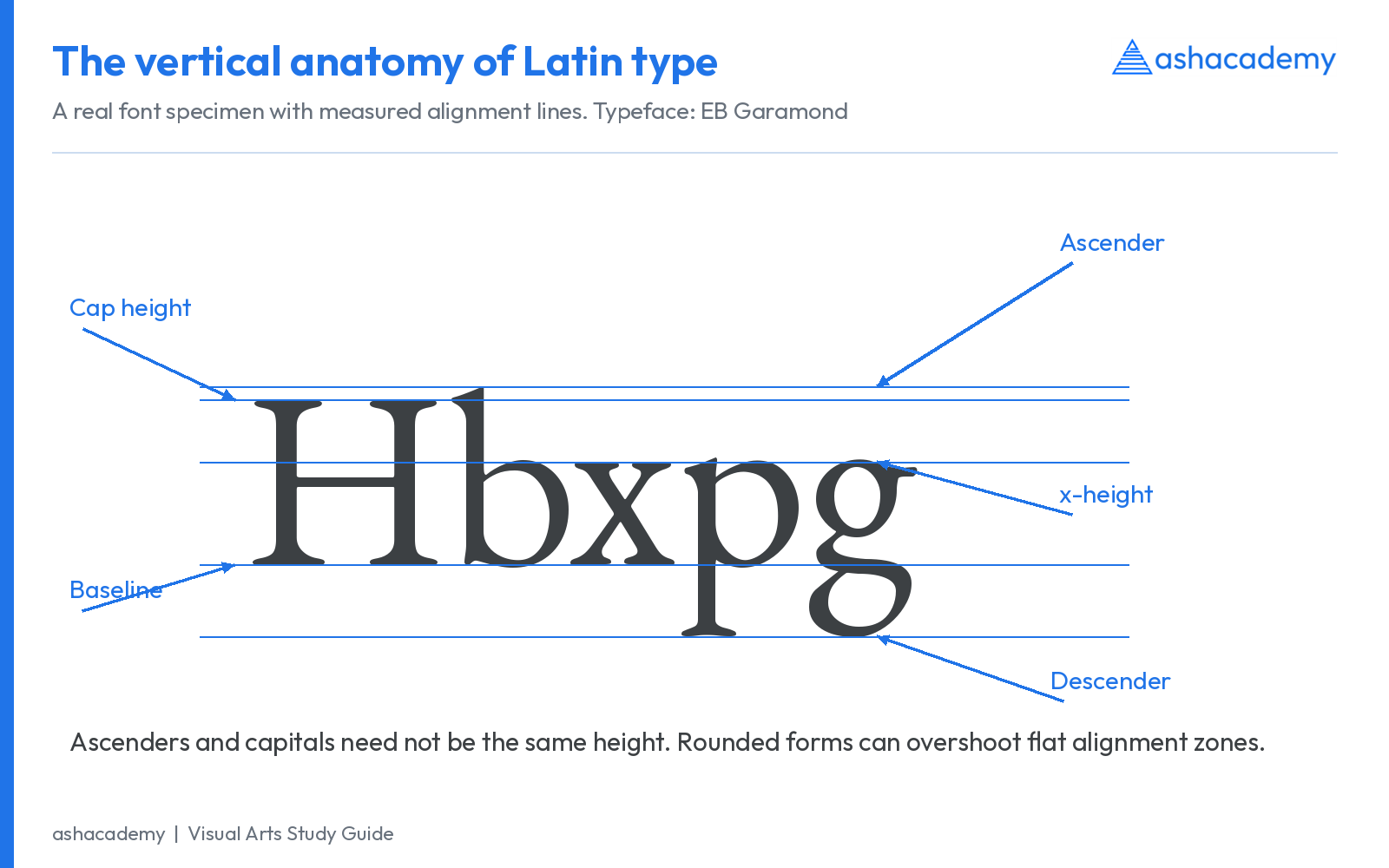
| Term | Meaning | Look at |
|---|---|---|
| Baseline | Reference line on which most non-descending Latin letters align. | The lower alignment of H, x and n. |
| x-height | Height of the lowercase x, used as a reference for the main lowercase body. | x, and the approximate body height of many other lowercase letters. |
| Cap height | Height of flat-topped capital letters measured above the baseline. | H or E; rounded O may extend slightly beyond it. |
| Ascender | Part of a lowercase letter extending above the x-height. | b, d, h, k, l. |
| Descender | Part extending below the baseline. | g, j, p, q, y, depending on the design. |
| Overshoot | Slight extension of round or pointed forms beyond alignment zones for optical balance. | Compare O with H, or o with x. |
| Em square | The font’s design coordinate framework, scaled to the chosen type size. | It is not the same as the visible height of a capital letter. |
Two fonts set at 12 points can look very different because x-height, width, stroke weight and spacing differ. A larger x-height often makes lowercase letters appear larger at the same nominal size, but does not guarantee better reading in every situation.
6. Letter anatomy chart: parts you should be able to identify
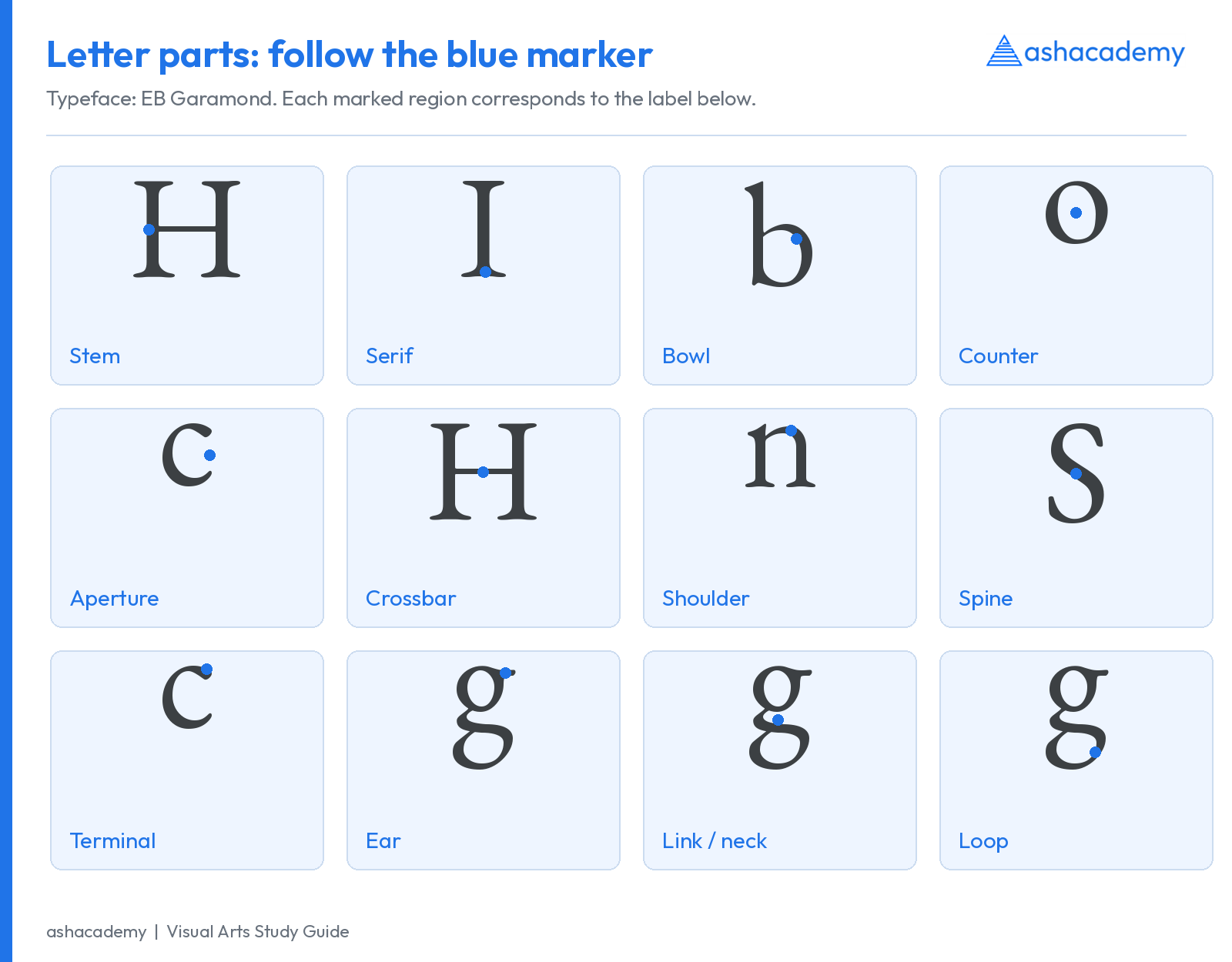
| Part | Definition | Typical example |
|---|---|---|
| Stem | Main generally vertical or diagonal structural stroke. | The upright of H or the main upright of b. |
| Serif | Finishing projection at the end of a principal stroke in a serif design. | The foot of a capital I or H. |
| Bowl | Curved stroke enclosing a space. | The rounded portion of b or P. |
| Counter | Internal negative space, enclosed or partly enclosed depending on usage. | The enclosed space in o, b or P; distinguish the white space from the black bowl. |
| Aperture | The opening into a partly enclosed counter. | The opening of c or e. |
| Crossbar | Horizontal stroke connecting or crossing other strokes. | The bar in H or A. |
| Arm / leg | An extending stroke free at one end; leg commonly describes a lower diagonal. | The upper arm of E; the diagonal leg of R. |
| Shoulder | Curving stroke that grows from a stem. | The arch of n or h. |
| Spine | Principal curving stroke of S or s. | The central curved structure of S. |
| Terminal / finial | A non-serif stroke ending; finial often means a tapered or curved ending. | The end of a stroke in c, a or f, depending on the face. |
| Ear | Small projecting detail on some lowercase g designs. | Upper-right projection of a two-storey g. |
| Link / neck | Stroke joining the upper and lower portions of a two-storey g. | The connector between its bowl and lower loop. |
| Loop | Lower enclosed or partly enclosed structure of a two-storey g. | The lower part beneath its upper bowl. |
| Tittle | Dot over lowercase i or j. | Do not call every diacritic a tittle. |
| Diacritic | Mark that modifies or distinguishes a character. | An acute accent, cedilla or script-specific mark. |
7. Stroke contrast, stress, weight and width
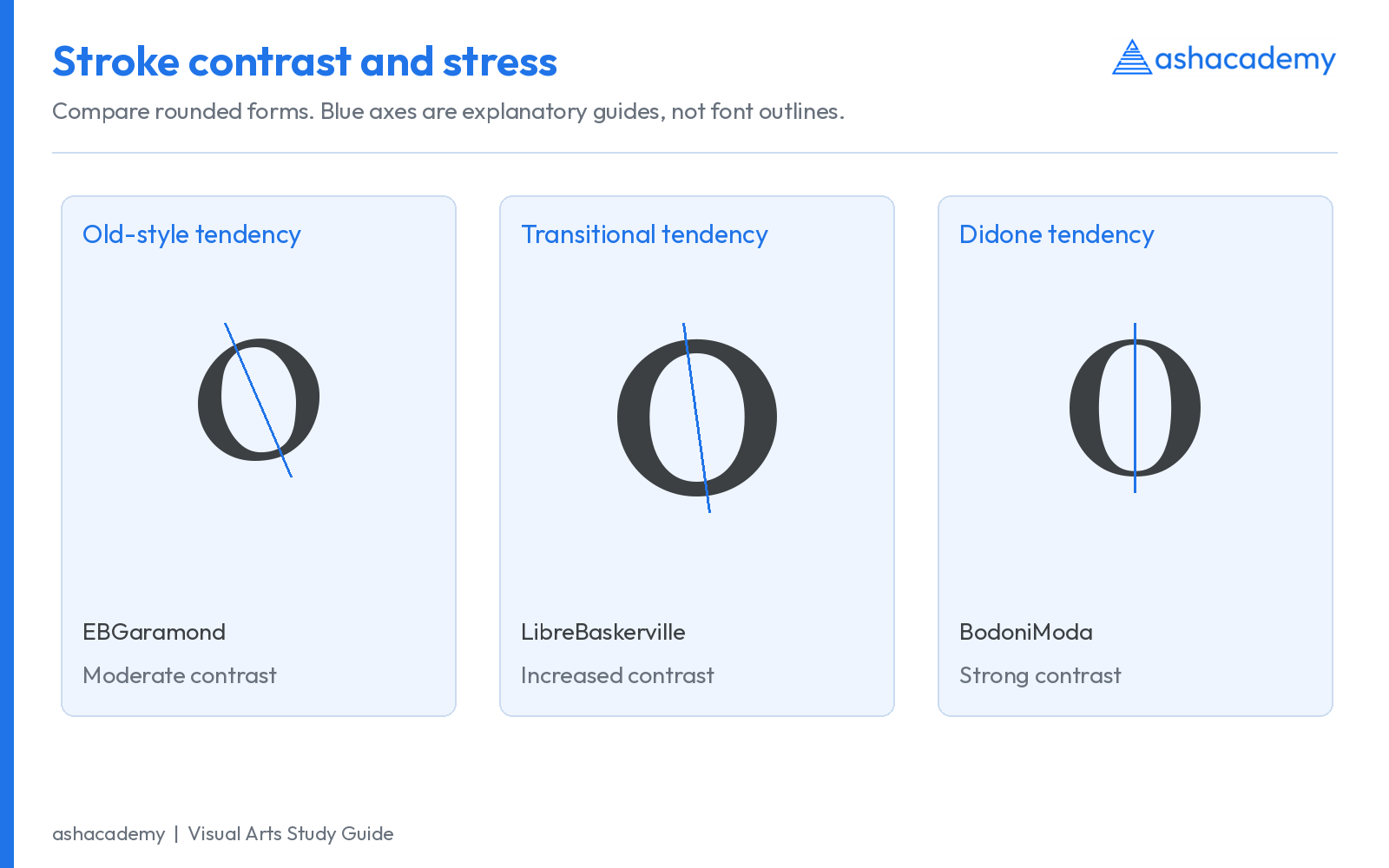
| Property | Meaning | Do not confuse it with |
|---|---|---|
| Stroke contrast | Difference between thick and thin strokes within a letter. | Weight: a very bold face can still have low internal contrast. |
| Stress / axis | Orientation suggested by the distribution of thick and thin strokes, especially in rounded forms. | Slant: an upright letter can still have diagonal stress. |
| Weight | Relative thickness or visual heaviness of strokes. | Point size: enlarging Regular does not turn it into Bold. |
| Width | Designed horizontal proportions, such as Condensed or Expanded. | Artificial stretching, which distorts stroke relationships. |
| Slant | Inclination of a letterform. | Italic construction: an italic can involve changed shapes as well as inclination. |
Use several clues together. Stress alone cannot reliably identify every typeface, especially in contemporary hybrids. Classification is a practical descriptive tool rather than a perfect scientific division.
8. Types of typography: a useful classification map
For study, begin with serif, sans serif, script, blackletter and display/decorative forms. Then distinguish historical and structural subgroups. Display is a role as well as a descriptive label: a serif, sans serif or script face can all be designed primarily for large-scale display. Monospaced describes a spacing system, not a historical category parallel to old style.
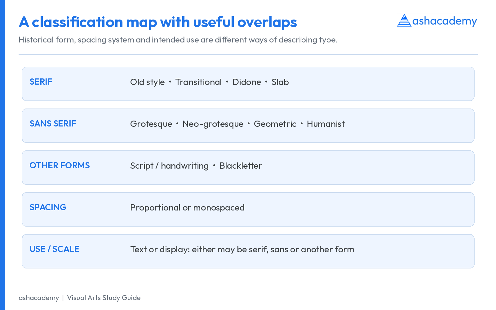
Typeface classifications have changed over time. Monotype discusses the limits of historical systems, while its learning archive offers a hybrid classification. Learn recognisable features and named examples rather than assuming a single universal list. Sources: Monotype: guide to type styles; MyFonts: type classifications.
9. Serif classifications: old style, transitional, Didone and slab
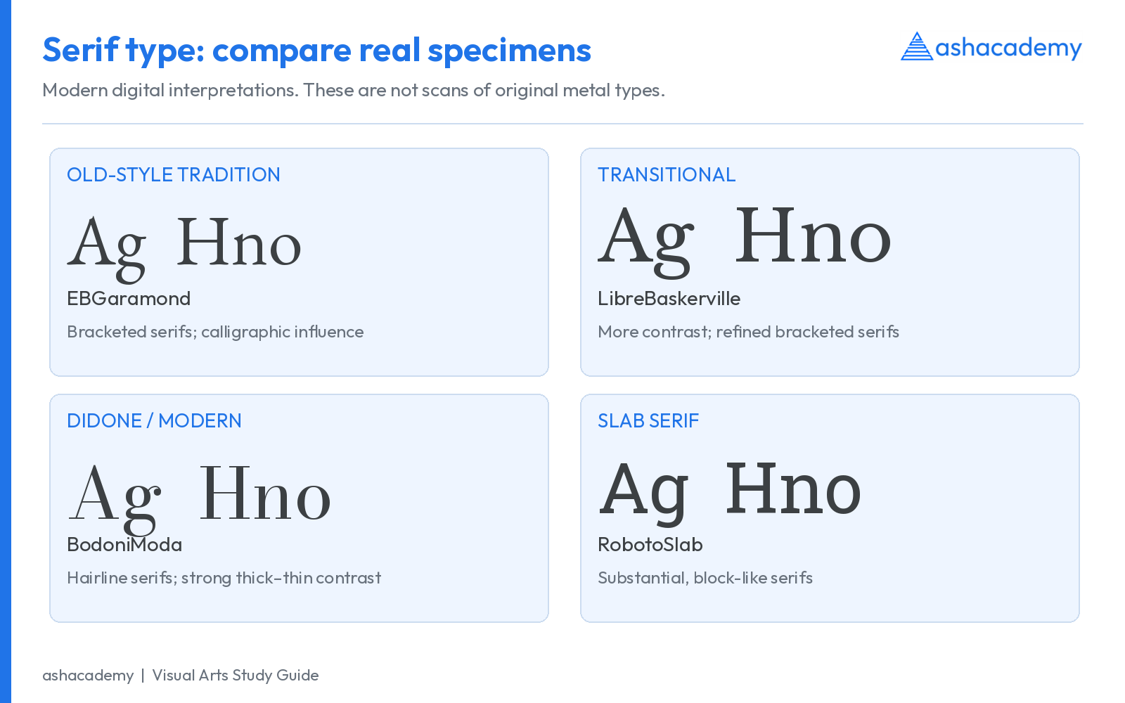
| Category | Typical characteristics | Historical examples / associations |
|---|---|---|
| Humanist / Venetian and old-style traditions | Calligraphic influence; often diagonal stress, moderate contrast and bracketed serifs. Venetian types often retain an angled e crossbar. | Jenson; later Garamond and Caslon traditions. Individual revivals vary. |
| Transitional | Generally increased contrast, more vertical stress and refined bracketed serifs. | Baskerville; Times is also commonly placed within transitional classifications. |
| Modern / Didone | Strong thick-thin contrast, vertical stress and fine, often unbracketed serifs. | Bodoni and Didot. Modern is the historical category, not a synonym for newly designed. |
| Slab serif | Substantial block-like serifs; often relatively low contrast. Bracketed and unbracketed varieties exist. | Clarendon, Rockwell and related commercial display traditions. |
How to identify: compare the serif’s shape and attachment, contrast, stress, proportions and the forms of a, e and g. A slab serif need not be a Wild West poster face; contemporary slabs can be designed for sustained text or digital interfaces.
Avoid fixed personality claims such as “all serifs are traditional” or “all Didones are luxury.” Such associations depend on cultural use, size, composition and context. Very thin hairlines may become fragile in small print or poor screen rendering even when they look elegant in a large specimen.
10. Sans-serif classifications: grotesque, neo-grotesque, geometric and humanist
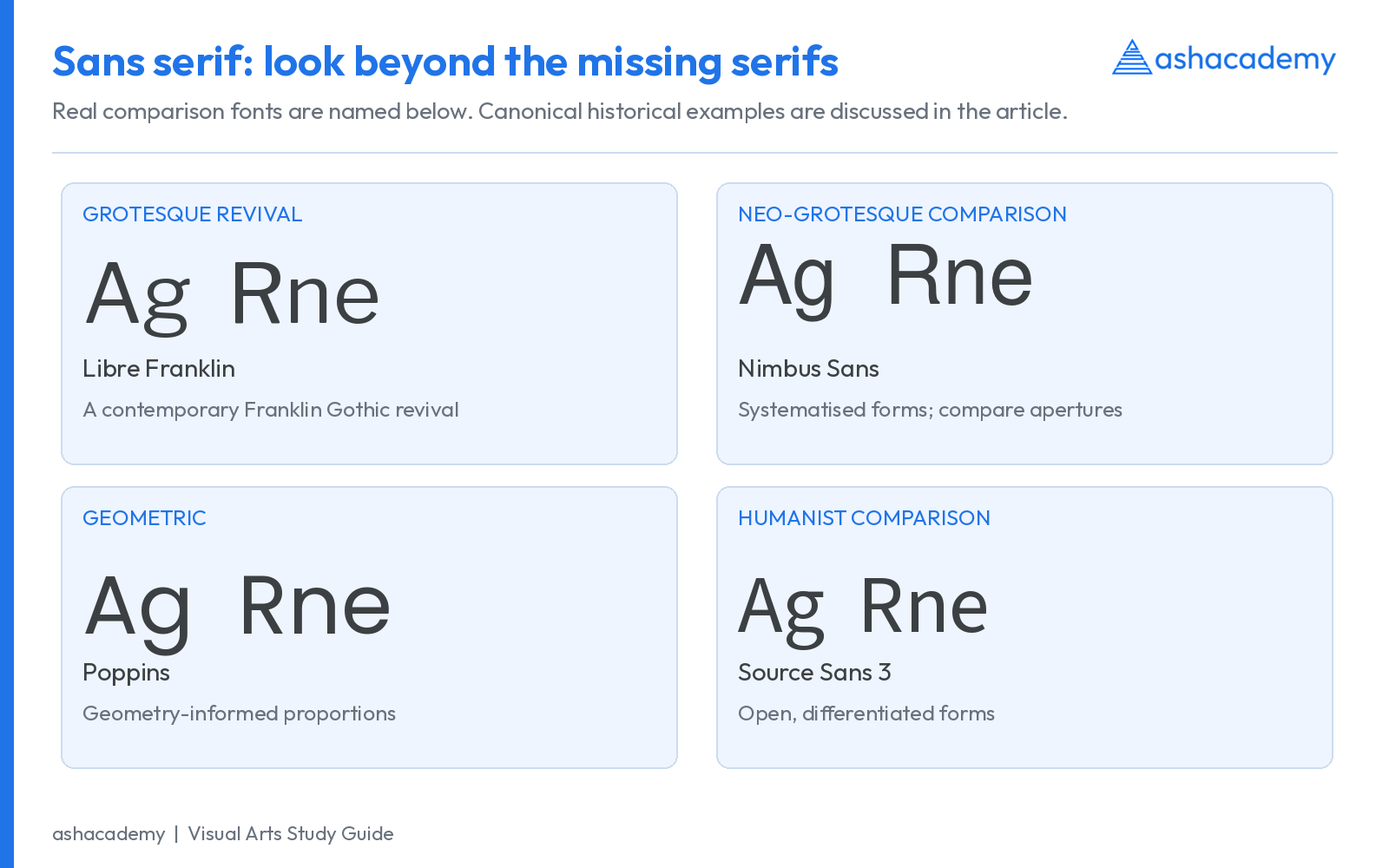
| Category | Useful clues | Canonical examples to study |
|---|---|---|
| Grotesque | Early sans-serif traditions; often some irregularity, contrast or idiosyncratic proportions. | Akzidenz-Grotesk and Franklin Gothic traditions. |
| Neo-grotesque | More systematised appearance; frequently relatively closed apertures and restrained differentiation. | Helvetica and Univers, both associated with 1957 releases. |
| Geometric | Construction suggests circles and simple geometric proportions, with optical corrections. | Futura, released 1927; Poppins is a contemporary multiscript geometric example. |
| Humanist | Forms retain influences from handwriting and classical proportions; often more open apertures. | Gill Sans and Frutiger; Source Sans 3 provides a contemporary comparison. |
“Sans serif” means without serifs. It does not mean no design variation. Compare a, g, R, e, numeral 1 and the openings of c and s. Also remember that the humanist label can occur in both serif and sans-serif discussions.
Futura is associated with modernist design culture but was designed by Paul Renner for the Bauer foundry. It should not simply be called “the Bauhaus font.” See Bauer Types: Futura, 1927.
11. Script, blackletter, display and monospaced type
| Group / property | What distinguishes it | Practical caution |
|---|---|---|
| Script | Forms evoke handwriting, formal penmanship or brush writing; connections may be joining or non-joining. | Do not add arbitrary tracking to a connecting script; joins can break. |
| Blackletter | Broken, angular or densely patterned forms derived from Gothic writing traditions. | Not synonymous with every font whose commercial name contains Gothic. |
| Display / decorative | Designed for expressive impact, often at large sizes. | A strong title face can be exhausting in long paragraphs. |
| Monospaced | Each glyph receives the same advance width within the spacing system. | The visible strokes are not equally wide: i and W occupy equal slots but retain different ink shapes. |
| Text type | Designed or adapted for sustained reading at relatively small sizes. | Assess rhythm, differentiation, spacing and reproduction in actual paragraphs. |
Classification questions sometimes mix unlike criteria. If the options are Serif, Sans Serif, Script and Monospaced, explain that the first three mainly describe form while the last describes spacing. A monospaced font can also have serifs or sans-serif forms.
12. Kerning vs tracking vs leading: the visual difference
| Control | What changes | Typical use |
|---|---|---|
| Kerning | Spacing between a particular pair of characters. | Correcting the apparent gap in AV, To or Wa in a headline. |
| Tracking | Overall spacing across a selected sequence of characters. | Opening a short uppercase heading or adjusting the overall density of a text run. |
| Leading | Baseline-to-baseline distance between successive lines. | Making a paragraph comfortable to follow vertically. |
| Word spacing | Space separating words. | Balancing justified text or preventing loose word gaps. |
| Paragraph spacing | Space before or after paragraphs. | Separating ideas without inserting repeated empty lines. |
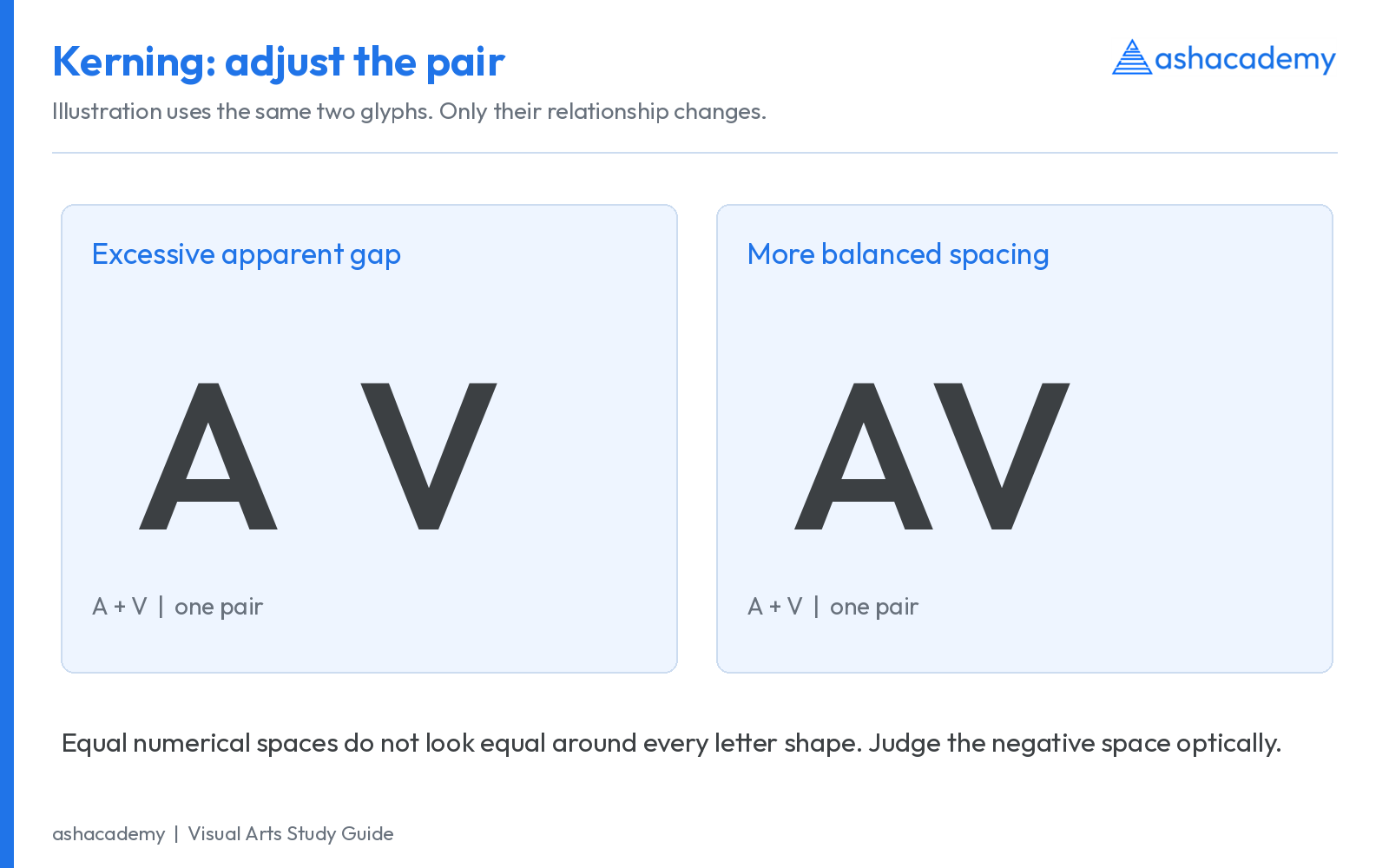
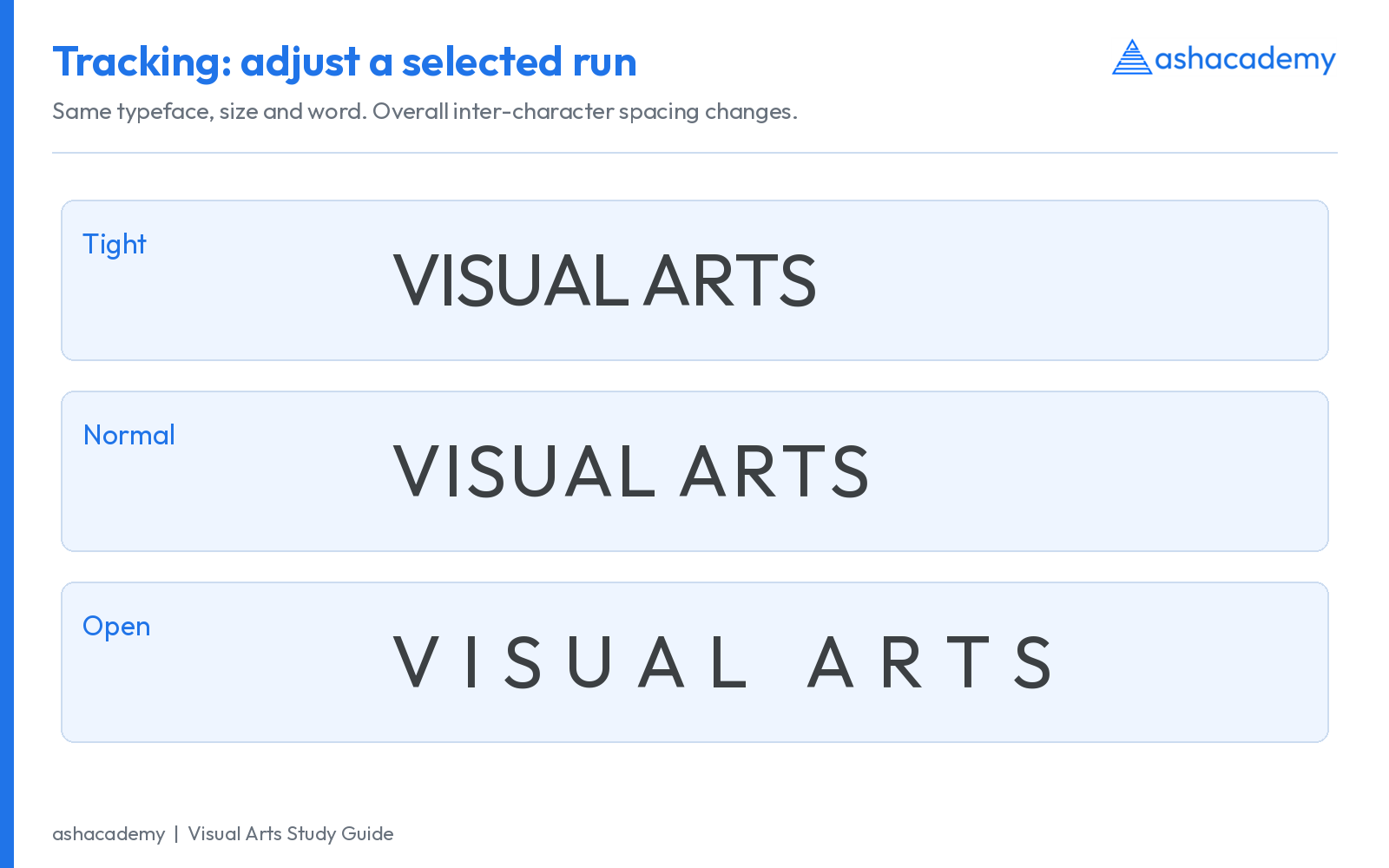
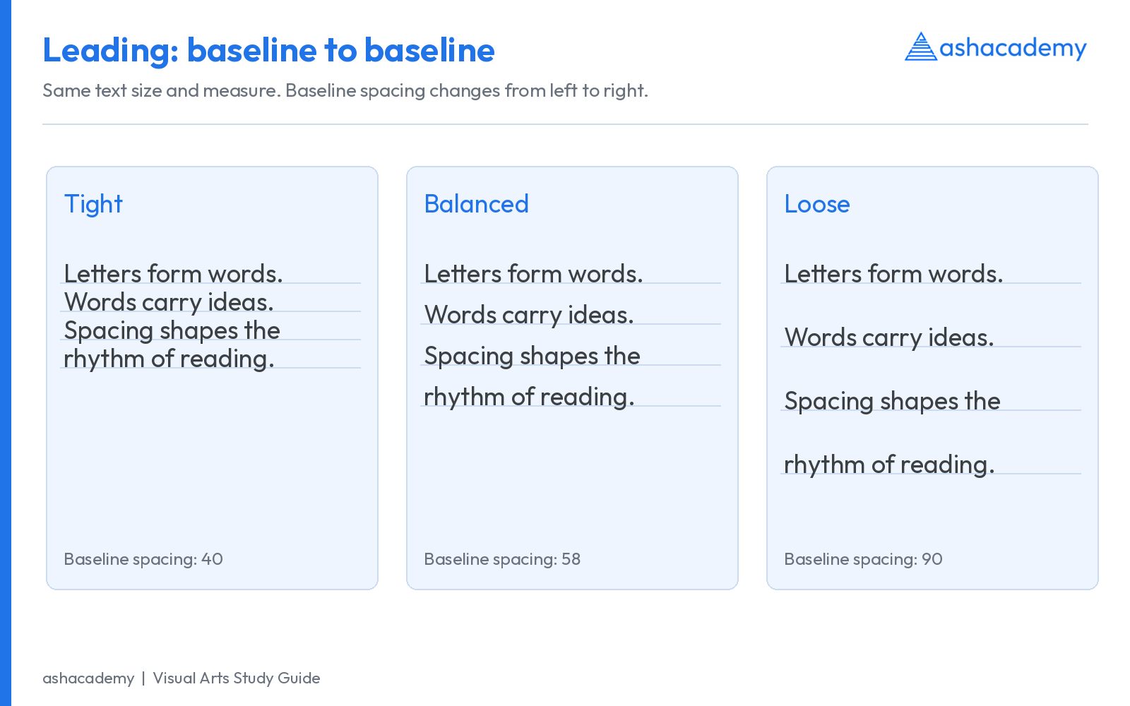
Adobe distinguishes metrics kerning, which uses spacing information supplied by the font, optical kerning, which estimates relationships from shapes, and manual adjustments. Tracking applies across a selection; it does not replace the need to inspect troublesome pairs. Source: Adobe: metrics, optical and manual kerning.
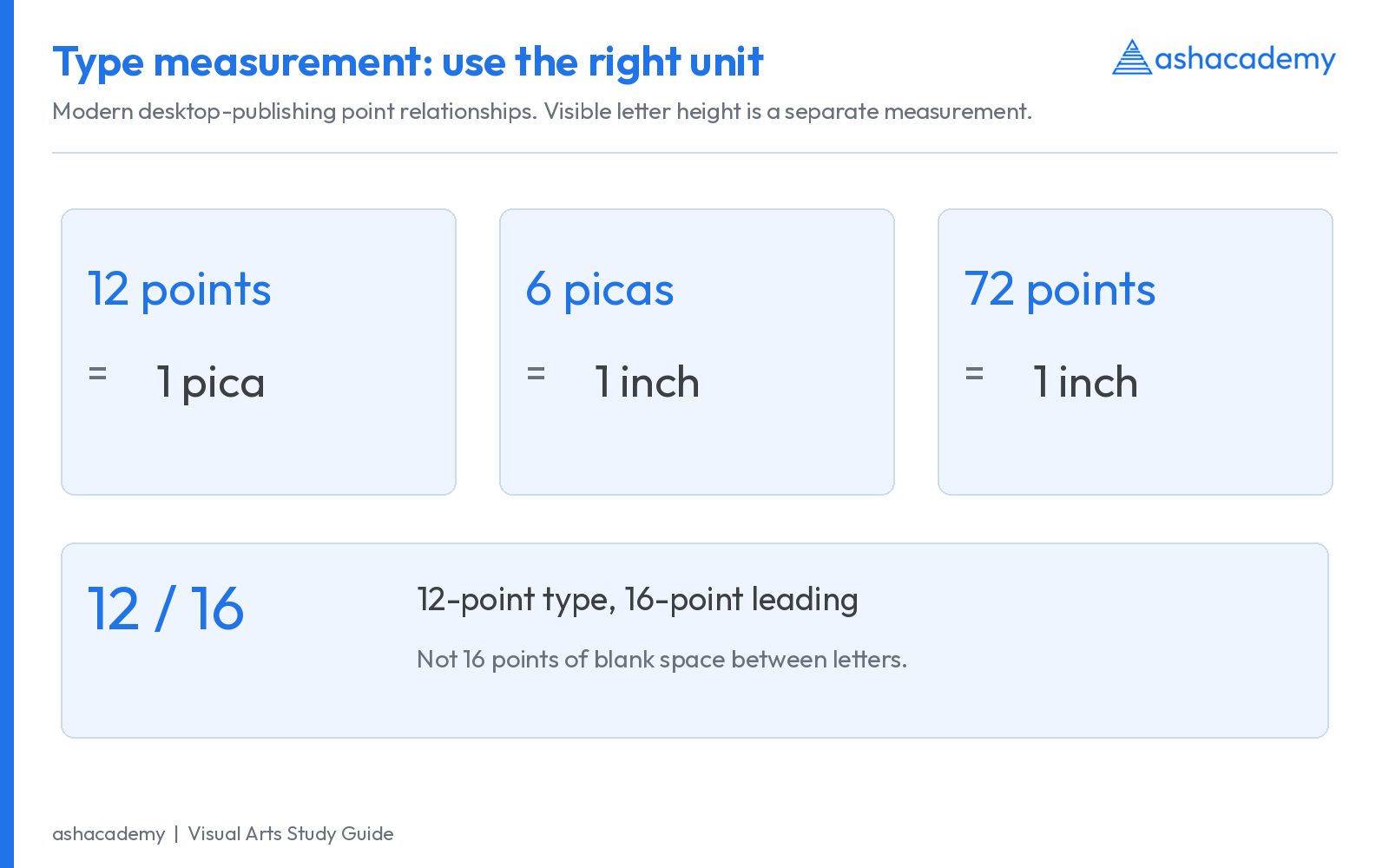
The traditional name leading comes from strips of lead used to increase space between lines of metal type. In digital typography, 12/16 means 12-point type with 16-point baseline spacing. It does not mean 16 points of empty space between the visible letters. Source: Adobe: tracking, kerning and leading.
13. Points, picas, ems and actual visible size
| Unit / term | Meaning | Example |
|---|---|---|
| Point, pt | In modern desktop publishing, 1/72 inch. | 12 pt is one-sixth of an inch as a nominal type size. |
| Pica | 12 modern points. | 6 picas = 72 points = 1 inch. |
| Em | Relative to the current font size in the relevant typographic context. | At 16 pt, one em corresponds to 16 pt; the visible M need not be one em wide. |
| CSS px | A reference unit used in CSS; it is not always one physical screen pixel. | 96 CSS px equal one CSS inch by definition, but physical display size depends on rendering. |
| Measure | The length of a line of text. | A narrow mobile column and a wide desktop column need different composition decisions. |
Do not measure type size by placing a ruler against a capital letter alone. Visible glyph height is only part of the font’s design space. Compare actual paragraphs at the intended output size before judging whether two faces are equally large.
14. Legibility vs readability
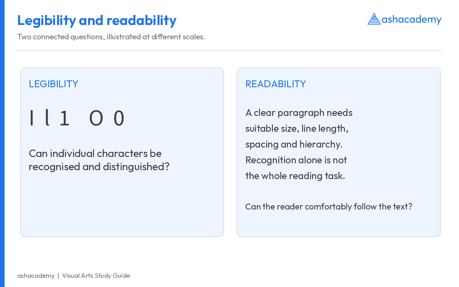
Legibility concerns recognising and distinguishing letterforms and characters. For example, can a reader distinguish capital I, lowercase l and numeral 1, or O and 0? Readability concerns the ease of reading connected text, including the effects of size, spacing, measure, alignment, hierarchy and content.
A recognisable display alphabet can still create an uncomfortable page if the lines are too long and crowded. Conversely, generous paragraph spacing cannot rescue a font whose critical characters merge at the required size. These terms overlap in some writing, so explain the aspect being discussed rather than relying on a rigid slogan.
- Test at the actual size and viewing distance, rather than only on a large design canvas.
- Compare several lines of real text, including punctuation and numerals.
- Inspect dense marks, counters and diacritics after printing or screen rendering.
- Use clear hierarchy and adequate contrast; do not rely on colour alone to indicate importance.
- For bilingual material, check the full Hindi and English passages, not only two isolated sample words.
15. Alignment, line length, grids and white space
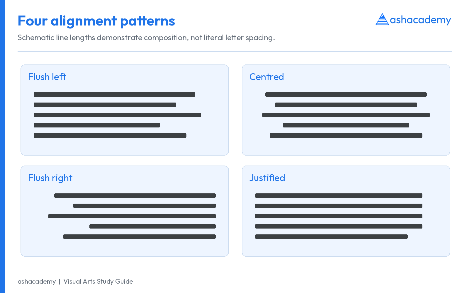
| Setting | Useful application | Risk to watch |
|---|---|---|
| Flush left, ragged right | A strong starting point for long English text. | A distracting rag or extremely short final lines. |
| Centred | Short titles, invitations and carefully controlled display arrangements. | Long paragraphs become difficult because each new line starts in a different place. |
| Flush right, ragged left | Short labels, captions or deliberate compositional relationships. | Harder to follow for extended left-to-right text. |
| Justified | Books and columns where line length, spacing and hyphenation can be controlled. | Rivers, excessive word gaps and stretched short lines in narrow columns. |
White space is active structure. It separates levels of information, groups related items and controls pacing. A grid helps align columns, captions, images and headings. A baseline grid can coordinate text across columns, but forcing every size onto an inflexible grid may produce awkward spacing.
Watch for a single short line isolated at a column boundary, a heading left without its paragraph, or an extremely short last line. Publishers use widow and orphan terminology in different ways; describe the actual defect when the naming could be ambiguous.
16. Typographic hierarchy: make the reading order visible
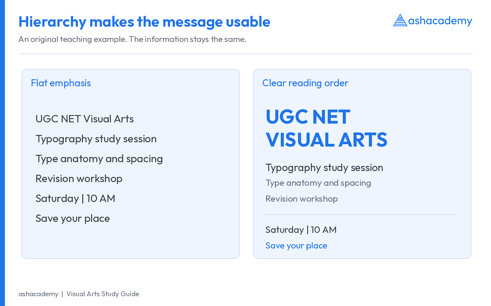
Hierarchy tells the reader what to notice first, what to read next and where to act. Establish it through size, weight, position, contrast, spacing and consistent roles. A page with six unrelated bold sizes does not automatically have six useful levels.
- Headline: states the main idea or promise.
- Subheading or deck: explains the angle or provides context.
- Body: supplies readable detail.
- Caption and labels: connect text with an image or feature.
- Action or navigation: makes the next step easy to locate.
In a course advertisement, “UGC NET Visual Arts” may be the headline, a short batch description the subheading, and the date and registration action a distinct lower group. Importance should decide visual emphasis. A decorative phrase should not overpower the subject, date or eligibility information.
Pairing typefaces without visual conflict
Begin with one well-designed family and different styles if that solves the problem. If using two families, establish contrast with a reason, such as a display headline and a restrained text face. Compare apparent size, x-height, proportions, weight and mood. For multiscript pairing, related rhythm and density matter more than forcing letters to look identical.
17. Italics, small caps, numerals and ligatures
| Feature | Meaning | Study point |
|---|---|---|
| True italic | A designed style that often changes letter construction as well as slant. | Compare the a or f with the roman style; avoid assuming every italic must change every letter. |
| Oblique | A slanted style that often retains more of the upright construction. | It can be deliberately drawn; it is not automatically a poor-quality fake. |
| Small capitals | Capital forms drawn to harmonise with lowercase text, usually near x-height or slightly above. | Shrinking full capitals mechanically can make strokes too light. |
| Lining figures | Numerals aligned in a relatively uniform capital-like height zone. | Often useful for headings and some tables. |
| Old-style figures | Numerals with varying heights and, in many designs, ascenders or descenders. | Can integrate well with lowercase text. |
| Tabular figures | Numerals with equal advance widths. | Useful for aligning columns of numbers. |
| Proportional figures | Numerals with widths fitted to their shapes. | Useful where even text rhythm matters more than column alignment. |
| Ligature | One glyph representing two or more characters, or a designed joined form. | Latin fi/fl ligatures and Indic conjunct shaping should not be treated as identical processes in every respect. |
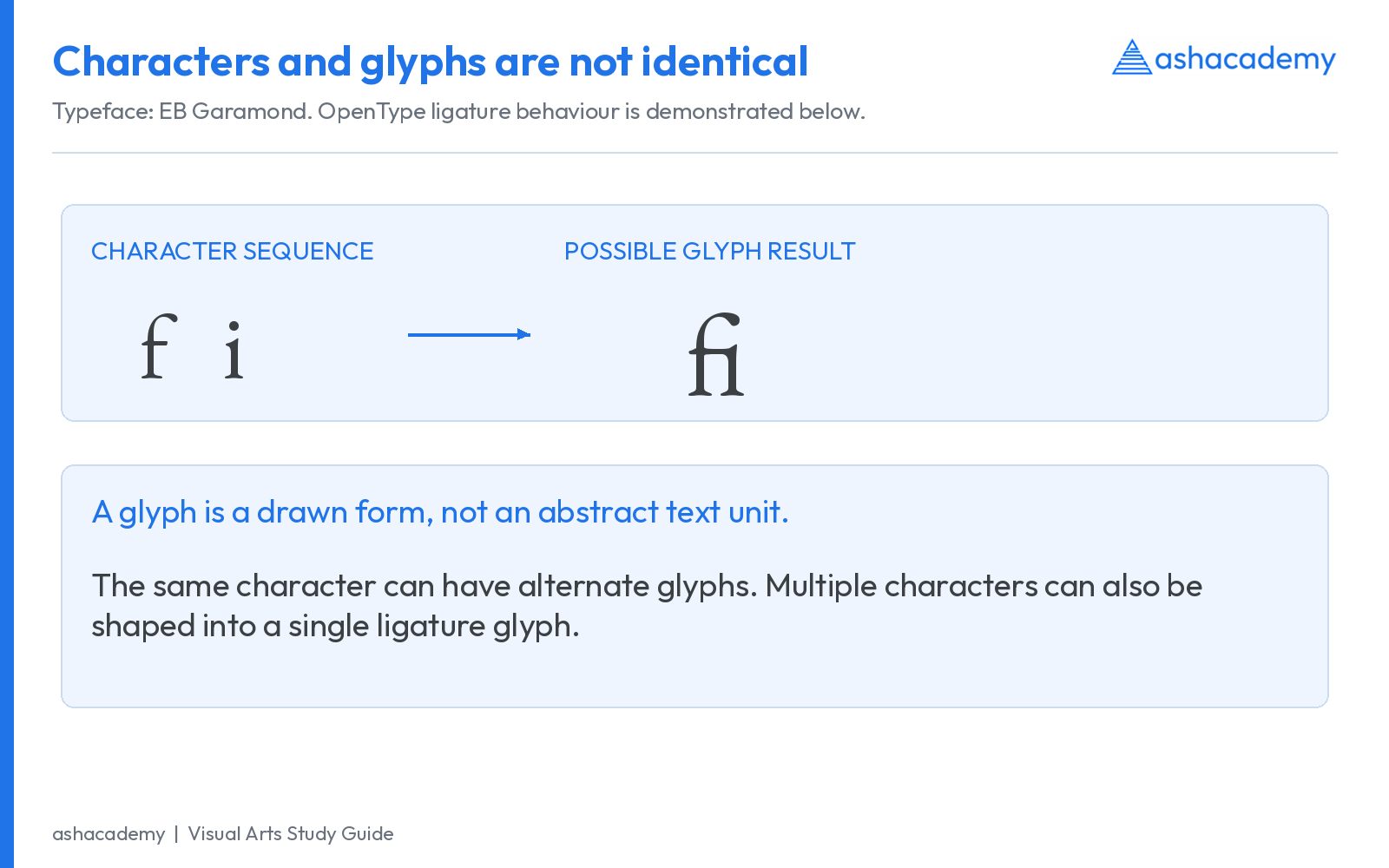
Lining/old-style and tabular/proportional answer different questions. A font can offer tabular lining figures and proportional lining figures, or comparable options for old-style figures. Do not memorise “tabular means capital height.”
18. Devanagari typography: structure, matras and shaping
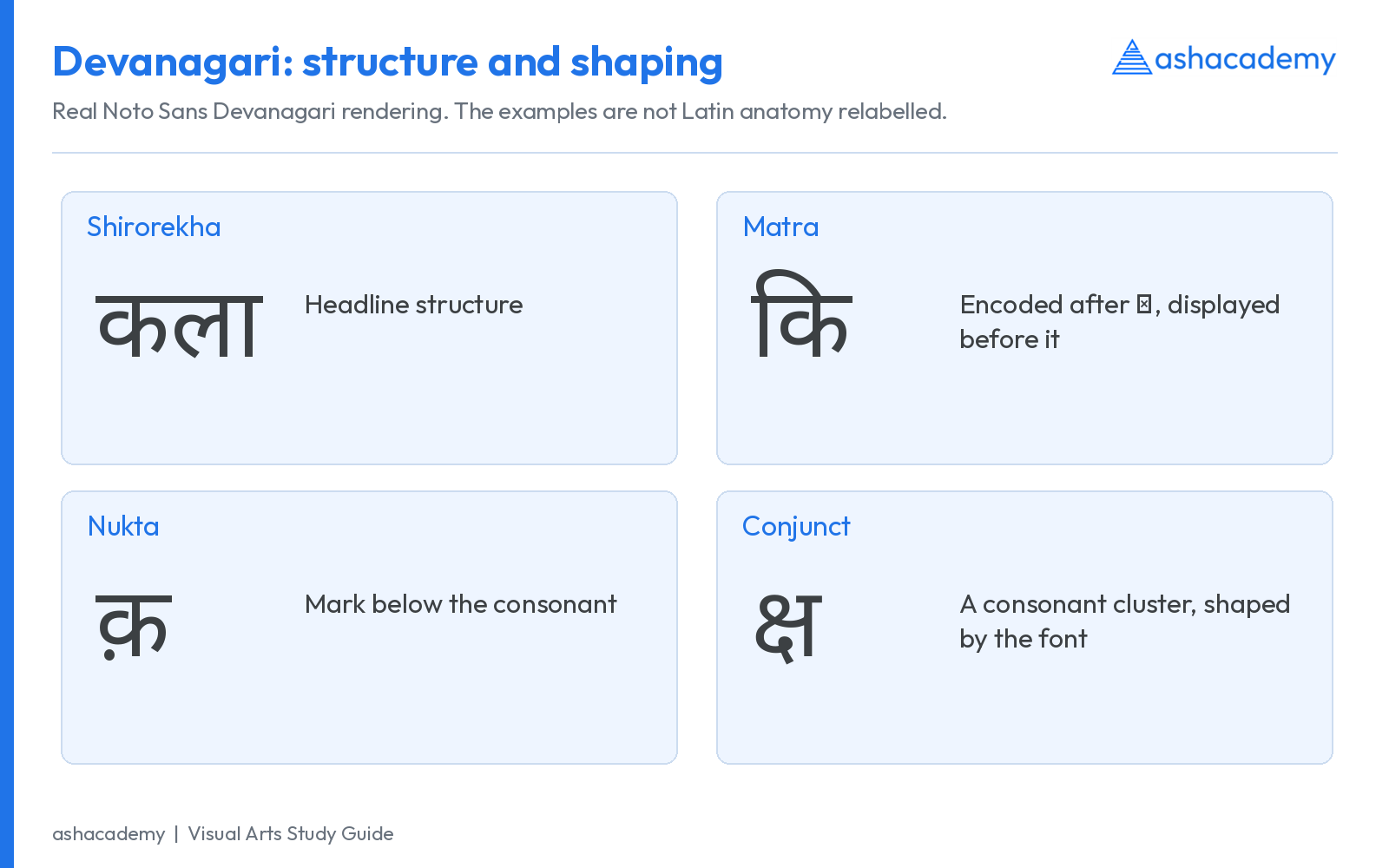
| Term / process | What it means | What to inspect |
|---|---|---|
| Shirorekha | The headline characteristic of many Devanagari letterforms and connected word forms. | Its continuity and relationship to the main body; not every mark is attached to it. |
| Matra | A dependent vowel sign attached to a consonant or consonant cluster. | Marks can occupy pre-base, post-base, above-base or below-base positions. |
| Virama / halant | A sign suppressing the inherent vowel in the relevant orthographic context. | It participates in consonant-cluster behaviour; the visible result depends on the sequence and font. |
| Conjunct | A combined consonant formation. | The result may use a ligature, half forms or another script-appropriate arrangement. |
| Nukta | A dot-like combining mark that distinguishes or modifies a consonant. | Correct placement and sufficient clarity at small sizes. |
| Shaping | The process that selects and positions appropriate glyph forms from a character sequence. | Correct conjuncts, reordering and mark positioning. |
For example, in कि, the vowel sign is encoded after the consonant but appears to its left. The screen’s visible order is therefore not a simple one-to-one map of keyboard order. Microsoft describes a shaping sequence involving analysis, reordering, glyph substitution and glyph positioning. Source: Microsoft: Devanagari shaping.
Do not manually separate a conjunct with arbitrary spaces to make a poster fit. Avoid adding Latin-style tracking without checking whether it disrupts the script. If marks disappear, overlap or form incorrect clusters, check the text encoding, font support and shaping application before blaming the spelling.
For Hindi-English compositions, test matching apparent size, line spacing and tonal density. Devanagari’s top and bottom marks may need more vertical room than a Latin-only sample suggests. Matching nominal point sizes is only a starting point.
19. Important typographers, designers and books
| Person / group | Association | Contribution to remember |
|---|---|---|
| Johannes Gutenberg | Mainz; Bible c. 1455 | A landmark European system of movable metal type and printing, not the origin of all world printing. |
| Nicolas Jenson | Venetian roman type, late 15th century | A central reference for humanist roman typography. |
| Aldus Manutius and Francesco Griffo | Aldine editions; 1501 italic books | Distinguish printer-publisher from punchcutter; italic and portable book formats. |
| Claude Garamond | 16th-century French roman types | Old-style tradition; modern Garamond families differ and can draw on different historical sources. |
| William Caslon | 18th-century English typefounding | Influential old-style roman and italic traditions. |
| John Baskerville | 18th-century Birmingham printing | Transitional forms and refined printing; his Virgil of 1757 is a key book milestone. |
| Giambattista Bodoni and the Didot family | Late 18th / early 19th-century high-contrast forms | Didone / modern serif traditions. The Didots were a family, not one unnamed designer. |
| William Morris | Kelmscott Press; Arts and Crafts | Revival of integrated book design, material quality and historical type traditions. |
| Herbert Bayer | Bauhaus; universal alphabet experiment, 1925 | Geometric, simplified letterform experimentation; distinguish an alphabet proposal from every later Bauhaus-labelled commercial font. |
| Paul Renner | Futura, 1927 | Geometric sans serif for Bauer; not a typeface authored by the Bauhaus school. |
| Jan Tschichold | Die Neue Typographie, 1928 | Codified functional, asymmetrical typographic organisation; his later book-design practice also engaged with classical conventions. |
| Stanley Morison and Victor Lardent | Times New Roman, 1932 | Morison’s direction, Lardent’s drawing and Monotype’s production formed a collaborative process. |
| Max Miedinger and Eduard Hoffmann | Helvetica, 1957 | Haas foundry development; Miedinger’s design work with Hoffmann’s direction. |
| Adrian Frutiger | Univers, 1957; later Frutiger family | Coordinated sans-serif family thinking and attention to legibility. |
| Hermann Zapf | Palatino, released 1950; Optima, released 1958 | Calligraphic knowledge informed both serif and flared sans-serif forms; distinguish early drawings from release dates. |
| Wilkins and Panchanan Karmakar | Early Bengali printing types | Collaborative technical and craft work; do not omit the Indian punchcutter. |
| Contemporary Indian type designers and foundries | Multiscript families; print and digital systems | Study actual font credits and script coverage, including the work of Indian Type Foundry and other independent practices. |
For secure date anchors use University of Birmingham: Baskerville and his 1757 Virgil, MoMA: Bayer’s universal lettering, 1925, Bauer Types: Futura, 1927, MoMA: The New Typography, Science Museum Group: Times New Roman, MoMA: Helvetica metal type, Alliance Graphique Internationale: Univers, 1957, Zapf Alphabets: Palatino and Zapf Alphabets: Optima. A typeface’s design, first publication, renaming and digital revival may have different dates; identify which event a question asks about.
20. New Typography, Bauhaus and the Swiss approach
Modern typography did not arise from one person or one institution. Constructivist experiments, Bauhaus teaching, changing printing technologies and modern communications contributed to new ways of structuring the page. The New Typography favoured functional arrangement and often used sans serifs, asymmetrical balance, strong scale relationships and photographic material.
Tschichold’s Die Neue Typographie of 1928 gave these tendencies a practical, influential formulation. Later Swiss or International Typographic Style is associated with systematic grids, sans-serif typography, asymmetrical organisation and a pursuit of visual clarity. These are related developments, not interchangeable labels for one identical movement.
In a visual analysis, explain how a composition works: the main alignment axis, relative scale, grouping, negative space and reading sequence. Merely writing “it uses a sans-serif font, so it is Swiss” does not establish the argument. Museum context: MoMA: The New Typography.
21. From metal type to variable fonts
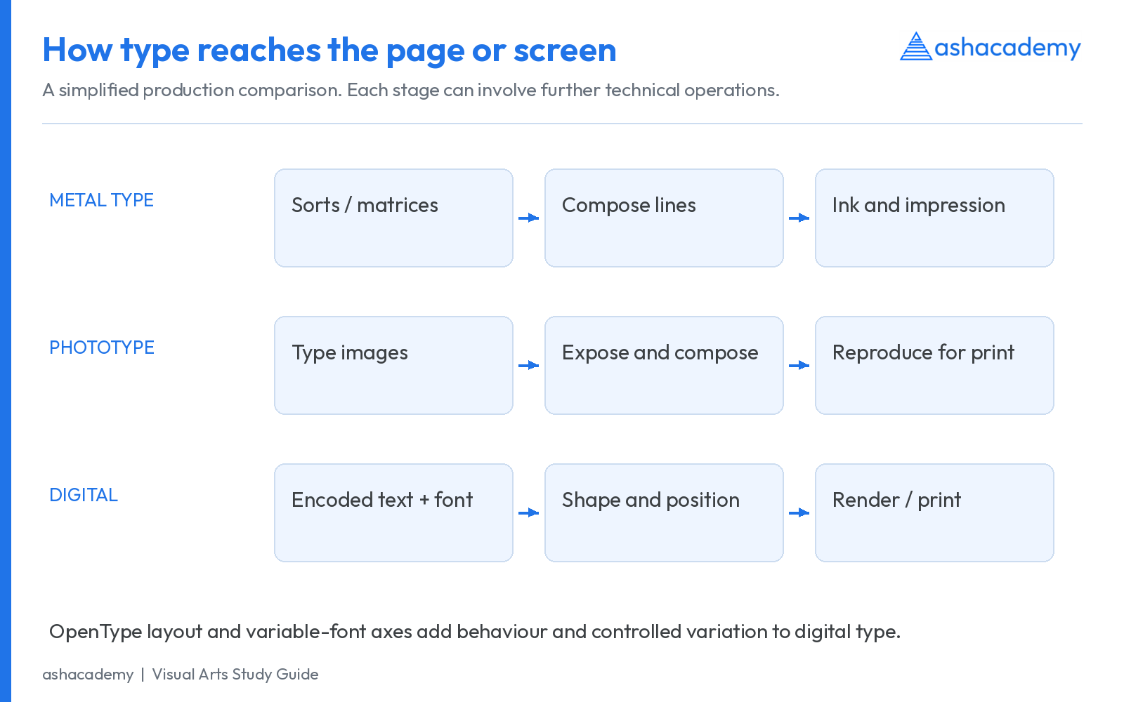
| System | Basic principle | Typographic implication |
|---|---|---|
| Hand-set metal type | Individual sorts assembled into lines and formes. | Physical type sizes, spacing material and labour shape composition. |
| Hot-metal composition | Machines cast type from keyboard-controlled matrices. | Linotype casts lines; do not assume every hot-metal system casts in the same way. |
| Phototypesetting | Type images exposed photographically rather than assembled as printing sorts. | Changes in scaling and composition preceded fully digital workflows. |
| Digital outline fonts | Glyph outlines and metrics are interpreted by software. | Outlines can scale, while rasterisation and hinting influence small-size appearance. |
| OpenType layout | Tables support substitutions, positioning and other typographic behaviour. | Essential for features such as ligatures, contextual forms and complex-script shaping. |
| Variable fonts | A font resource supports variation along defined design axes. | Weight, width, optical size, slant or other axes may be available; not every variable font has every axis. |
A variable font is not just a set of unrelated fonts placed in a folder. Its supported design space allows controlled variation and interpolation. An optical-size axis, when supplied, can adjust features for different reading sizes; it is different from merely enlarging the outline. Source: Microsoft: OpenType Font Variations.
A font licence determines permitted uses. A font being downloadable does not automatically mean it can be redistributed, embedded or used commercially without conditions. Read the licence attached to the exact file or family. The specimens in this article use openly licensed fonts whose names and repository are supplied in the visual credits.
22. Typography for print, websites and accessibility
- Print: check actual output size, stock, ink spread, fine strokes, reversed text and proof quality. A desktop preview cannot reproduce every printing condition.
- Web: keep essential content as selectable text, use meaningful heading levels, provide robust font fallbacks and check loading behaviour.
- Responsive layouts: adapt measure, spacing and hierarchy to the available width; do not simply shrink an entire desktop page.
- Contrast: W3C WCAG AA uses at least 4.5:1 for ordinary text and 3:1 for qualifying large text, with specified exceptions. Large text generally means at least 18 pt, or 14 pt when bold. These are contrast criteria, not a recommendation to set all body text at those sizes.
- Zoom and spacing: ensure text enlargement and user adjustments do not hide or overlap important content.
- Visual explanations: provide useful alt text and accompanying written explanations so a diagram is not the only route to the information.
Accessibility references: W3C: minimum text contrast; W3C: resizing text. Typography supports access when the reader can recognise, follow and adjust the text, rather than merely admire the page.
23. How to analyse typography in an advertisement
| Step | Question to ask | What a useful answer contains |
|---|---|---|
| Identify | What script, type category and styles are present? | Visible evidence: serif shape, contrast, width, case and joining behaviour. |
| Prioritise | What do I read first and second? | Size, weight, placement, grouping and contrast. |
| Inspect spacing | How are letters, words and lines organised? | Pair spacing, tracking, leading and measure, described separately. |
| Relate | How does type interact with image and white space? | Alignment, overlap, rhythm, balance and negative space. |
| Interpret | What tone and audience relationship does it construct? | A context-based explanation rather than universal font stereotypes. |
| Evaluate | Does it communicate at the intended size and medium? | Legibility, reading order, language support and production quality. |
Example: a course poster uses a geometric sans-serif headline, a restrained body face and a separated date block. Its hierarchy succeeds if the subject is recognised first and the date remains easy to locate on a phone. If the same poster spreads a joining Devanagari word with excessive letter spacing, it may damage the script even while making the English heading look airy.
Apply this method to the examples in our Types of Advertisements guide and connect the historical discussion with History of Advertising in India.
24. Common examination confusions: a correction table
| Confusion | Correct distinction |
|---|---|
| Typeface and font are exactly the same in every period. | Separate the design from its implementation, while noting changes in historical and digital usage. |
| Kerning increases all letter spaces. | Kerning concerns specific pairs; tracking concerns a selected run. |
| Leading is the visible white strip between lines. | It is baseline-to-baseline spacing. |
| Point size equals capital-letter height. | Nominal type size and visible cap height are different. |
| Bowl and counter are the same. | Bowl is the stroke; counter is the internal negative space. |
| Modern serif means recently designed. | Modern / Didone is a historical and formal classification. |
| Sans serif means geometric. | Geometric is only one sans-serif tendency. |
| Italic is always mechanically slanted roman. | True italics can have different construction; obliques can also be deliberately designed. |
| Gutenberg invented printing worldwide. | Earlier printing and movable-type traditions existed in East Asia. |
| Futura was designed by the Bauhaus. | Paul Renner designed Futura for Bauer; its release was 1927. |
| Helvetica and Univers have the same designer. | Associate Helvetica with Miedinger/Hoffmann; Univers with Frutiger. |
| Hindi is the name of a script. | Hindi is a language; Devanagari is a script. |
| One character always equals one glyph. | Substitution and shaping can produce different relationships. |
| Monospaced means every visible letter shape is equally wide. | Advance slots are equal; the inked shapes differ. |
| A font that displays English correctly will display every Indian language. | Script coverage and shaping must be checked for the required text. |
25. One-page revision framework
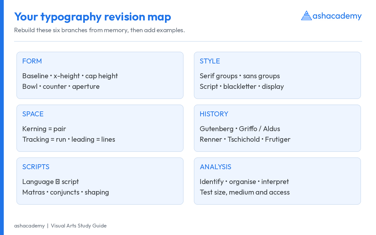
- Five vertical terms: baseline, x-height, cap height, ascender, descender.
- Three internal-form terms: bowl, counter, aperture.
- Three spacing controls: kerning, tracking, leading.
- Four serif groupings: old style, transitional, Didone, slab.
- Four sans-serif tendencies: grotesque, neo-grotesque, geometric, humanist.
- Four date anchors: c. 1455 Gutenberg Bible; 1501 Aldine italic books; 1928 Tschichold’s book; 1957 Helvetica and Univers.
- Three digital concepts: character vs glyph, script shaping, variable-font axes.
For stronger recall, make a comparison note instead of an isolated definition: “kerning = pair; tracking = run; leading = lines.” Then attach a small drawing. A definition that you cannot recognise visually remains incomplete preparation for a visual subject.
26. Original practice questions with explanations
The following questions were written for this guide. They are practice questions, not claimed previous-year questions, and do not predict the examination.
1. Which adjustment specifically changes the relationship between A and V in a headline?
Kerning. It targets the pair; tracking would change a selected run.
2. What does 12/16 mean in conventional type notation?
12-point type with 16-point baseline-to-baseline leading.
3. Identify the negative space enclosed by the rounded stroke of b.
The counter. The surrounding curved stroke is its bowl.
4. Which category commonly combines vertical stress, strong contrast and fine unbracketed serifs?
Didone / modern serif. Bodoni and Didot are central historical associations.
5. Match the designer: Futura; Univers; Times New Roman.
Futura: Paul Renner. Univers: Adrian Frutiger. Times New Roman: Stanley Morison, Victor Lardent and Monotype’s collaborative production.
6. A font contains a weight axis but no width axis. Can its width be varied through that axis?
No. Available axes are specific to that font; weight support does not imply width support.
7. Why may a 12-point font look larger than another 12-point font?
Its x-height, proportions, weight and spacing can differ despite the same nominal size.
8. Why is Hindi-English type pairing more than choosing matching point sizes?
The scripts have different structures, mark positions, density and vertical-space requirements.
9. Put these in order: Univers; Gutenberg Bible; Futura; Die Neue Typographie.
Gutenberg Bible c. 1455; Futura 1927; Die Neue Typographie 1928; Univers 1957.
10. Does one fi ligature glyph prove that the text contains only one encoded character?
No. Multiple encoded characters may be rendered as one glyph.
27. Frequently asked questions
What is typography in Applied Art?
Typography is the selection and arrangement of type to organise a message through letterforms, hierarchy, spacing and composition. In Applied Art it serves communication across advertisements, publications, packaging and digital media.
Which typography topics should I study for UGC NET Visual Arts?
Study calligraphy, movable type, typefaces and families, letter anatomy, type classification, early typographers, printing developments and their use in visual communication. Read the exact scope in the official Code 79 syllabus linked above.
What is the difference between kerning, tracking and leading?
Kerning adjusts particular character pairs; tracking changes overall spacing across selected characters; leading is the distance from one line’s baseline to the next.
What are the main classifications of type?
A useful starting map includes serif, sans serif, script and blackletter forms, with display as an overlapping use category. Serif and sans-serif groups contain further subcategories. Monospacing describes spacing rather than a historical style.
Who designed Futura, Helvetica and Univers?
Futura is by Paul Renner, released by Bauer in 1927. Helvetica is associated with Max Miedinger and Eduard Hoffmann at Haas in 1957. Univers is by Adrian Frutiger, also released in 1957.
Is typography the same as calligraphy?
No. Calligraphy creates writing through tool movement; typography arranges reproducible type. They influence each other and can overlap within the same project.
Can I use these charts to make revision notes?
Yes, use the charts alongside the written explanations to prepare personal revision notes. The font specimens name their actual digital fonts; historical dates refer to the events specified in the article.
28. Sources, visual credits and further reading
This is an independent educational guide by ashacademy, not an NTA or UGC publication. Use it with the official syllabus, reliable books and question practice. Historical dates identify the event stated, rather than implying that design, first appearance and later revival always occurred in the same year.
- UGC Visual Arts syllabus, Code 79
- Library of Congress: Gutenberg Bible
- Library of Congress: printing before Gutenberg
- Cambridge University Library: Aldine italic, 1501
- Biblioteca Marciana: italic in 1500 and 1501
- Monotype: guide to type styles
- MyFonts: type classifications
- Adobe: tracking, kerning and leading
- Adobe: metrics, optical and manual kerning
- Goa Department of Printing and Stationery: press history
- Bibliothèque nationale de France: printing Indian texts
- Microsoft: Devanagari shaping
- Microsoft: OpenType Font Variations
- MoMA: The New Typography
- Bauer Types: Futura, 1927
- MoMA: Helvetica metal type
- Alliance Graphique Internationale: Univers, 1957
- Science Museum Group: Times New Roman
- Science Museum Group: Ottmar Mergenthaler
- Indian Type Foundry: multilingual type design
- Typotheque: Indian Type Foundry announcement, 2009
- W3C: minimum text contrast
- W3C: resizing text
- Google Fonts: font files, credits and licences
- Asian Art Museum: Bi Sheng and movable type
- BnF: Jikji, 1377
- University of Birmingham: Baskerville and his 1757 Virgil
- MoMA: Bayer’s universal lettering, 1925
- Zapf Alphabets: Palatino
- Zapf Alphabets: Optima
Further book study: Robert Bringhurst, The Elements of Typographic Style; Ellen Lupton, Thinking with Type; Philip B. Meggs and Alston W. Purvis, Meggs’ History of Graphic Design; Jan Tschichold, The New Typography (original German publication, 1928). Consult the edition available to you; pagination and translated publication dates vary.
Visual credits: Diagrams, flowcharts, comparison layouts and thumbnail are original teaching graphics prepared for ashacademy. Actual font specimens use Outfit, EB Garamond, Libre Baskerville, Bodoni Moda, Roboto Slab, Libre Franklin, Poppins, Pacifico, Source Sans 3, Noto Sans Devanagari and Nimbus Sans, as identified in the images. These are contemporary digital files, not reproductions of original historical printing. Font-specific licence and copyright notices accompany the source fonts in the Google Fonts: font files, credits and licences repository and the relevant system-font distributions. The ashacademy logo is the supplied brand asset.

You may also like
Fauvism: History, Characteristics, Artists and Important Artworks
Symbolism in Art: History, Characteristics, Artists and Artworks